Friday, 17 December 2010
Wednesday, 15 December 2010
Final Product.
So here we go, after developing our original idea, re-shooting more footage, and advancing to another editing programe, we have finaly reached our final product. Watch and enjoy.
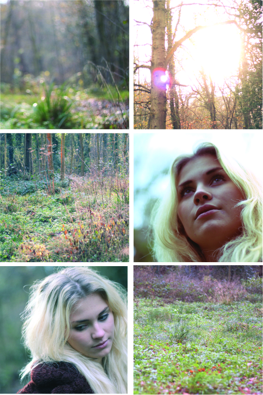
I am very please with how the final product came out. I am especialy pleased with the overall feel of the video, and how the story now relates to the lyrics and follows the conventions of a music video. Here are some of my favourite parts of the video.
I like them due to the composition, tones use of a shallow depth of field or the camera movement.
Friday, 10 December 2010
2nd Day of filming.
Today went really well! We were lucky with the weather, as it matched our first shoot day perfectly, so during the editing, we would not have to do much post production to match the tones. We managed to collate enough footage to fill the one minute slot which we needed to fill. So now we just need to put it all together and smooth it all out and we will have our final product.
Thursday, 9 December 2010
Re- casting
After storyboarding, we decided we needed to bring the "boyfriend" in to represent the break up. We decided my media partner Tom would step in to fill this role. I think they worked really well as an onscreen couple and played the role perfectly. They looked like an authentic couple, and due to their close friendship, were able to work really well together.
Tuesday, 7 December 2010
Storyboard for 2nd shoot day.
So after deciding to film another lot of footage, we needed to decide what to shoot and how.
We decided that to give a story to the video, we should add in what happened before hand, in the lead up to her being in the woods. We decided the best way to do this is to film a break up, as that would bring in the link with the song, as some of the key lyrics in the song are;
" I gave you all I got, you wouldn't have it" and " You go your way and i go mine"
if we bring this connection in visualy, then it would be a more successfull products as that is a major convention of a music video.
We then sketched down some ideas for possible shots, and the order we want them to be in. Here is our hand drawn story board;
We decided that to give a story to the video, we should add in what happened before hand, in the lead up to her being in the woods. We decided the best way to do this is to film a break up, as that would bring in the link with the song, as some of the key lyrics in the song are;
" I gave you all I got, you wouldn't have it" and " You go your way and i go mine"
if we bring this connection in visualy, then it would be a more successfull products as that is a major convention of a music video.
We then sketched down some ideas for possible shots, and the order we want them to be in. Here is our hand drawn story board;
Monday, 6 December 2010
Audience Feedback.
We showed the second draft to a few clasmates and teachers to see what they thought. Here are some of the responses we got.
" I don't understand? Who is she and why is she in a wood?"
" Where did the guitar come from?"
" Is she upset, or thinking?"
" Where is the link between the lyrics and the clips?"
" There are too many nature clips, they all need cutting down"
After receieveing this positive feedback, we decided it was neccersary to go out and film some more footage. As we needed more narrative structure and interweaving storylines to involve the audience more. So we organised another filming day and got to work planning our shots.
" I don't understand? Who is she and why is she in a wood?"
" Where did the guitar come from?"
" Is she upset, or thinking?"
" Where is the link between the lyrics and the clips?"
" There are too many nature clips, they all need cutting down"
After receieveing this positive feedback, we decided it was neccersary to go out and film some more footage. As we needed more narrative structure and interweaving storylines to involve the audience more. So we organised another filming day and got to work planning our shots.
Sunday, 5 December 2010
Second Draft
We moved our project over to Adobe premiere Pro, as this let us create a more professional product. This second edit also turned out better than the one we created on iMovie purely because we had more possibilities with the editing.
I feel this edit is better than the previous one also due to the composition, i believe we have stiched the clips together in a better order. But i'm still not 100% happy with it. I feel there is something missing. So i've decided to get some audience feedback, to see what the target audience think of the product.
Saturday, 4 December 2010
Switching over to Premiere
Here are two screen shots, one of Premiere, and one of iMovie. As you can see iMovie is very simple and easy to use, where you have a window with all your footage, and a simple timeline where you can drag your clips into, where you can then alter, trim and manipulate. Where as Premier allows you to trim with much more precision, you can also alter the sound more precisely and accuratly.
In Premiere, it allows you to layer your footage ontop of each other, to create more effective blends and transitions and special effects. Where as this is not at all possible in iMovie.
As you can see in (4) iMovie has a very simplistic alteration tool, which is effective, but we wanted a very professional looking video. Premiere allowed us to do this with its multiple effects, which gave us as much manipulation power as photoshop does.
![]() |
| (1) |
![]() |
| (2) |
![]() |
| (3) |
![]() |
| (4) |
Friday, 3 December 2010
My Ansillary Products; Final Advert Design
For My final Product I decided it would be best to have a Portraight version, as it would be easier to use in a magazine like the NME. So here is my final Design;
In my final development, i had to rearrange the images and text to fitj into an A4 portraight size page. I also blended a wet brush into the background to ad a vintage effect. I did this by lowering the opacity
My Ansillary Products; Development of Advert
Here is my favourtire design out of the four. I carried on developing it, by adjusting the colours of the image, changing the layout, adding an apprpriate record label logo and adding a release date.
My Ansillary Products; Advert Ideas
Here are 4 ideas for a possible Magazine advert which could appear in the NME or similar. I tried to create 4 completly different styles. I then got some audience feedback on my ideas, to help me discover what would go down well with its possible audience.
Wednesday, 1 December 2010
Tuesday, 30 November 2010
First Draft of Music Video
Here is the first draft of the music video, the filming day went well, and got all the footage which we wanted to capture from our key shot story board. We put the edit together on iMovie 09.
I think that for a first draft it went really well, we were happy with the outcome as it gave us a good foundation to work on. We then sat down and analysed the video and set ourselves some targets and improvements for our second draft. We also showed our video to a possible audience, as we believe audience feedback is key in the development of our product.
Back cover Development
Here are 4 ideas of possible back covers for my album, I changed the layout and font of the text, and used different blending tools to create a different effect. By blending the text into the background I managed to create a kind of mystical effect, one which suits the genre of music.
After Picking my favourite one I continued to explore different texts and blending options till I got the perfect cover. I also inserted some legal text at the bottom along with a barcode to add to the authenticity of the final product.
Monday, 29 November 2010
Front Cover development.
Here are 4 Possible front covers for the album. I have kept them fairly simple, like the ones i have researched, as i believe this simple approach makes for a more attractive cover, and therefore would attract more attention with one striking image. Also after my research i discovered it Fits the genre of music perfectly. I used a classic Typewrite font and Georgia, which gives a classic feel to the cover, i also used the blending tools to make it more subtle and classic. I also positioned them either at the top or bottom, so it doesn't distract the audience from the eye catching image.
After picking my favourite one, i went on to adjust the positioning, fonts and colours, until i reached a final outcome which i was happy with. I picked this over the others as it is an emotive image and the colours work really wel together and compliment each other nicely.
Here is My final design for the front cover.
My Ansillary Products ; Photoshoot for CD cover
When we were out filming our second lot of footage for our Music video, we decided we would do our Photoshoot for our ansillary products there as well, as i think the setting we were in really suited the name of the album " What btter place than here" We used our model from the video, Leah, and i asked her to not give the camera eye contact, to add a distance between her and the audience, and to show that she is lost in thought, and that the location really means something to her and lets her think freely.
I took 120 Photos for the shoot, so I've cut the 12 out as the best suited for that of a CD front cover and reverse. I have edited and cropped them in Photoshop, to give the cold, crisp effect i was looking for. I'll then go on to experiment with text until i reach a final outcome.
Friday, 19 November 2010
Conventions of a Music Video
Here i have analyised the band which have been of biggest influence to my production, Mumford and Sons, and broken it down to pick out what i believe are thekey conventions into making a successful music video...
Subscribe to:
Posts (Atom)